q+a | pawling print studio

i am so pleased to present the beautiful work of pawling print studio. i first discovered the shop in 2009, and instantly fell in love with the minimal, contemporary aesthetic of their product portfolio. it's been so nice to witness the studio grow and flourish in the time since. trisha and janet are absolutely delightful, and i have really enjoyed learning more about them and their creative process, as i know you will...

Pawling Print Studio is named for your paternal grandfather, who was a photojournalist, painter, and a great source of inspiration for you. He taught you to paint and encouraged an appreciation of the arts at an early age. In what way do you see his creative influence in your work today?
We probably took away more from his process than from his style. Our grandfather was always a photographer, but he began painting much later in life and was completely self taught. He really embraced the learning process and was a patient student and teacher. He took classes, read books, watched videos, and painted almost every day. He had boxes full of inspiration photos and always carried a camera so he could capture light, color, and details that he wanted to paint later. It’s so easy to look around online at amazing work and convince yourself that you’re not skilled enough or talented enough to succeed, but these days there are so many incredible resources that our grandfather didn’t even have access to. Just thinking about his determination is enough to push ourselves out of our comfort zone.
You live in different states and work from separate studios, and yet produce designs that appear to be seamlessly collaborative. Walk us through your creative process.
Well, there’s a lot of cursing when it comes to e-mailing gigantic files back and forth, our communication could still be improved, and we dream of the day we will be closer together, but being apart has also helped us develop ideas without being influenced too much by what the other is doing. As far as being seamless, our individual aesthetics are pretty similar. We generally like and dislike same things, with very little falling in the middle. We’ve found that small things such as using the same pen to draw and adjusting the scale of our designs go a long way toward making our collections more cohesive. That and editing out the majority of our designs! Editing is probably the most important and challenging part of being a designer and we’re lucky that between the two of us, we always have a set of fresh eyes to evaluate our work.
After spending so much time on the computer in our fields of study, we were both ready to explore more analog methods. There’s something really satisfying and meditative about drawing by hand. We have found that the slower pace really allows our minds to wander in a way that working on the computer does not. We still use technology, but it creeps in at the end when we are editing rather than at the beginning when we are designing.
We were lucky to have lived in Singapore for six years and to have had the chance to travel throughout Asia, where patterns are applied to everything from clothing and crafts to art and architecture. We were exposed to a wide range of patterns - linear, organic, ornate, abstract, calligraphic, geometric, traditional, contemporary, eastern, western - sometimes in isolation but often in combination. We’re particularly drawn to the complex tile patterns and lattice work in older Islamic structures, but the simplicity and sparseness of Japanese and Scandinavian design really resonate with us too. They may not seem immediately compatible, but we’re interested in exploring the intersection of these ideas.
Environmentally responsible design is very important to you. What eco-friendly methods are employed in your production process?
From a production standpoint, we’re always trying to improve our methods. We look for durable, recycled, and natural materials, and we are transitioning to water and soy based inks for printing. From a creative standpoint, we try really hard to avoid trends. We aren’t interested in disposable products that only last one or two seasons. We hope our designs have more staying power than that!
. favorites .
You are both former dancers, and love to dance around your studio(s) to unwind.What is a favorite song or album you listen to while working?
We love Buena Vista Social Club for printing [dancing!] and lately we’ve been listening to a lot of Andrew Bird and Iron & Wine while drawing and computer-ing. Janet might also be the youngest person with a soft spot for old crooners and can somehow sing along to even the most obscure songs, so sometimes those slip into the mix as well.
You describe yourself as “bag ladies”. Name your favorite accessory designer.
We like classic items that will last a long time and we prefer scarves to jewelery. We have a growing collection of Moop (http://www.moopshop.com) bags and love our giant scarves from Martha’s SCARFSHOP (http://scarf-shop.com). We also try to buy textiles whenever we travel.
Your design palette is minimal and clean. What’s your favorite accent color?
It definitely changes with the seasons, probably a splash of mustardy yellow or dusty pink for spring/summer and a deep red or brown for fall/winter. We both lean more towards warm, natural colors.
Each of you share with us something the other brings to your collaboration to make it work so well.
This one is really hard, since our personalities and tastes are almost too similar. Well, our phases of motivation and doubt seem to be on opposite sine curves, which works out really well for us and makes us pretty even as a team even though we fluctuate much more individually. On a day to day level, Trisha has become more of the behind the scenes tech person and Janet has taken over a lot of the packaging and customer services duties.
And finally, what’s next for PPS?
Our biggest challenge is scaling up production so we can wholesale, which is both exciting and terrifying. In addition to expanding our current product lines, we would eventually like to add some silk scarves and yardage to our collection. And of course we’re always making new designs. We’d love to develop more complex patterns and to do a lot more with tiling and non-orthogonal grids.
pawling print studio has graciously offered a product giveaway for . o p a t . readers:
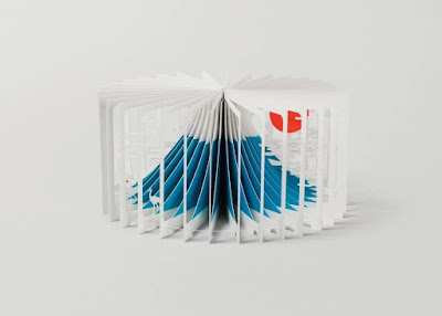
a pack of 4 geometric notebooks and a set of 8 geometric greeting cards - all hand drawn designs, printed onto recycled materials with soy-based inks. comment on this post, tell me which of these wonderful products you'd love to have, and you'll be entered to win. i'll draw two names, one for the cards and one for the notebooks (based on your stated preference). please post your comment by 8am, friday, june 17, and i'll announce the winners at 9am. good luck!!
*only one comment per reader, please :)


Comments
Thanks for opportunity to win one of their veautiful work! Geometric notebooks are my favourite.
of course, both the cards and noyebooks are stunning, but i'd like to win the cards :)
thanks for a great giveaway x
I would love to win the notebooks..
.:.
I guess now I won't be the first to leave the comment for the giveaway, but what the heck! :) I'm in.
Love the patterns, the materials and the approach. Screen-printed patterns have always been my favorite form of ''fabric art''.
I love the designs, lines and patterns are my favorite, especially when they are hand drawn designs. I would be so excited to get my hands on either the note books or cards, but the set of cards would be ideal.
thanks so much!
Love the notebooks. Can't seem to have enough of those : )
I'd love to win the set of notebooks. ;)
Thanks for the feature and giveaway!
campanita_Caro@hotmail.com